51. Alpha
Posted: 10/06/2013 Filed under: Making of, Uncategorized Leave a commentIt’s been a while since I up-dated the blog, the reason is quite simple, I’m back at work.
My real work that is… After (almost) finishing the animation, I needed to go back to work to save money to be able to finish the compositing and music of the film.
The compositing is when you add up all the layers of animation to create the final picture. It’s usually (in my case) the main character on top of the background, but it can be much more complex, with camera moves, sfx (like rain or fire), depth of field, etc.
 +
+  =
=

To be able to add the character on top of the background, each frame of animation needs an Alpha. An alpha is a black and white pictures that tells pictures where to be transparent, white is not transparent and black is fully transparent.

The checker board is where I want the drawing to be transparent.

There are various techniques to create a drawing’s alpha, in my case the line of the drawing are not closed so it makes it quite hard to use automatic techniques, so I decided to draw each alpha in photoshop. To do so I created a script that pre makes the alpha (using the magic wand) and I would correct it by hand, then save the picture as a png, which handle the transparency very easily. If you want to know more about the script gimme a shout, I’ll be happy to send it to you.
The whole process is quite short (1 min per drawing), but because you have to do it for each drawings, and I am working with big files (long saving time), it adds up to quite a lot of hours.
It took me around 3/4 week to do all the shot, I did that after work, witch doesn’t speed up the process at all, the good new is that every shot I animated so far have an alpha now, so I can work on compositing the shots.
As a little reward for finishing all the alpha, and as a joke, I edited a fake trailer for the film, it’s put together using the automatic trailer maker that comes with iMove, its stupidly easy to do and takes about 5 minutes and here it is:
As a disclaimer, those are just work in progress.
50. (Up)Market
Posted: 06/13/2013 Filed under: Words | Tags: 2d, Background, Black and White, Desert, drawing, film, illustration, market, print, Screen Print Leave a comment
The rhythm here has got quite intense, so I didn’t have time to post last week. I’ve been animating a lot and preparing a few thing (for Mcbess x the dudes factory “Dead Ahead” and printing my own stuff)
So This Sunday, Simone and I will be in brick lane’s Sunday (up)Market, to sell prints, screen prints, books and T-Shirts! We’ll be there all day.
In pure white trash tradition, I’ll be stocking beers under the stall, so if you’re in East London, this Sunday, come and say hello, have a beer with us and maybe buy some shit!
More about the film, I animated the first shots fully on computer (I’ll talk more about why I did it on computer on next week post: brushes part 02) and I’m really happy with the result. It was extremely fast and quite exciting, but I’m glad I’m animating on paper.
48. Brushes! part 1
Posted: 05/31/2013 Filed under: Animation, Making of, Uncategorized, Words | Tags: 2d, Art, black, brush, drawing, how to, illustration, make, making of, pen, pencil, photoshop, tutorial Leave a commentAllright, so before I decided weather or not it was possible to do any secondary animation on computer, I had to check that I could replicate the drawings fully digitally.
For this I would need a brush (in photoshop, or what ever other software) that replicates the way my pen behave on paper.
This actually means that I need to replicate what the drawn lines look like once scanned.
Step 1: What to replicate

I start by drawing various type of strokes: Slow, fast, overlapping, light and heavy strokes.
Step 2: Understanding parameters

The amount of parameters can be overwhelming but if you take them one by one it’s actually straight forward.
– First you need to choose your brush size to match the pen. You won’t be able to change the size of your brush once its finished, it will look odd. If you need a bigger brush, youll need to scan a bigger pen and create a new brush.
From now on stroke on the right is pen stroke on the left is “cg”

I’ve set the hardness to 33% because the pen is not drawing perfectly sharp.
Note: the size of your brush depends on the size of your document (because it’s set in pixels) here i’m working at 300 dpi. If I was at 600 dpi i’d have to scale my brush up twice.
I keep it round because it’s a classic pen.
– Then lets set the shape dynamics:

The size jitter “randomise” the size of the brush in the range you set (here the brush can be 50% bigger or smaller). The size is also control by the pen pressure and I’ve put a minimum size so the brush doesn’t disappear when I’m drawing lightly. (Here you need to match the diameter of your lightest pen stroke)
The size jitter represent the flow of ink of your pen and the randomness due to the paper, not the wobbliness of your stroke due to how you draw. I am not using the angle jitter and roundness jitter since my brush is round.
– Scattering moves the brush in different axis, i am not using it here.
– Textures and Dual Brush aren’t useful in this case.
– Color Dynamics
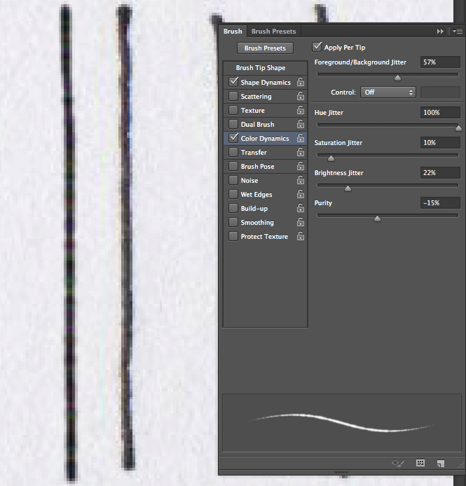
Color dynamics gives your stroke a more natural/scanned look. Scanner never scan black as black, it’s multicolor darkness. Here my foreground color is a very dark blue and my background color is a very dark red. They are being mixed randomly at 57%.
A brush is just a succession of dots really close to each other. What the randomizing option does is give each dot a different value, in hue, brightness and saturation. The purity seams to multiply the effect. At -100 the brush turns black and white…
Note that if you un-tick “apply per tip” the color changes is applied to the whole stroke. It can give some nice effects.
– Transfer

Here you’ll need to set the opacity and flow of your brush. As you can see on the strokes on the left, the pen doesn’t cover the paper regularly (more or less ink comes up).
The opacity and flow are both transparency but one is applied by stroke, the other one is applied as you draw. With opacity you need to lift your pen and draw again to have a color twice less transparent whereas with flow if you draw twice in the same place in a single stroke, this place will be twice less transparent.
The important thing at this stage is to play with the pressure of your wacom pen. You might end up really easily with a completely transparent brush when your not putting a lot of pressure on your pen. You need to set the minimum opacity to something that suite you.
– brush pose is some kind of 3d ness of your pen on the wacom. lets not bother with it.
– The next parameters have no options. I change them on/off as I draw depending on the effect I want to give:
noise:

Adds sharp noise to the stroke.
– Wet edge

Makes the center of the brush lighter and the edges darker
– build-up is some kind of airbrush option.
– Smoothing smooth you brush stroke, I wouldn’t use it with a tablet if you want a hand drawn feel…
At this point you should have a brush fairly similar to your pen:
red arrows show the cg brush strokes.
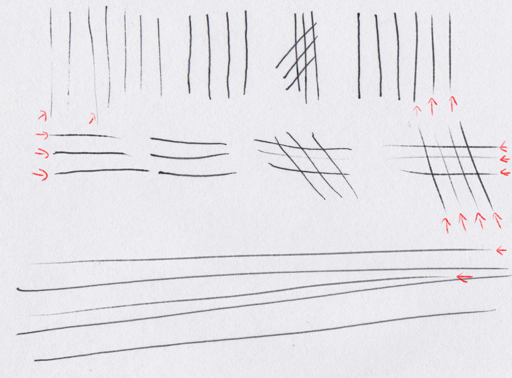
The only option i couldn’t find is to have more opacity/flow at the beginning of a stroke, I think it would look much more natural. If anyone knows how to do this, let me know!
Sorry for the bad english, this took more time then i though and I need to go back to work…
Cheerios
47. Yiynova MSP19U
Posted: 05/24/2013 Filed under: Uncategorized, Words | Tags: 2d, alternative, Animation, Art, awesome, cintiq, drawing, illustration, MSP19U, pen, pencil, review, rotoscopy, short film, tablet, tablette, Yiynova Leave a comment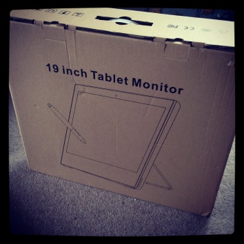
After reading Frenden review a couple of month ago I was really keen on trying out the MSP19U, a cintiq alternative at only 30% of the price.
It was out of stock for a long time, so last Sunday, when it was back on Amazon, I ordered one. I just got it yesterday.
Since lots of people seamed interested, I thought I would share what I think of it, here.

My overall opinion is GOT FOR IT. After drawing several hours on it, it’s just a perfect tool.
I never used a new cintiq so I can’t compare the Yiynova (pronounced yinova apparently) and the new cintiq. I did try an older model of cintiq and was not convinced, to much parallax, lag and muddy color, the cintiq was also too heavy and big.
But here is what you need to know about the MSP19U,and what probably justify the lower price.
Pros:
–Price (only 680£ with delivery)
–Size (quite small and light, you can draw with it siting on your lap in front of telly)
–Pen feels better then wacom IMO (smaller tip holder) even though when you open it to put the battery it feels like a kid toy.
– Screen is solid glass and looks better then a cintiq.
– Drawing ecperience is perfect, no lag, no jitter, pression is awesome.
– The tablet seams like good quality, nothing like fisher price or anything.
Cons:
– Set up: It took me a while to figure out how to get the right resolution with the mac. TIP: turn your mac of before connecting it, and then on. Don’t just do a restart.
– Viewing angle is rubbish, you can’t use it as a proper monitor, it’s just for drawing. When you sit back you can see a gradient. But when you draw it’s perfect.
– Cursor jitter when your not drawing and the pen is on the screen, it’s not a problem for drawing, but when you use the slider on a browser or highlight something, it’s quite obvious.
– No space for keyboard: the tablet touches the desk so you cant put your keyboard underneath. It means that your body is 20/25cm away from the actual screen. A bit like if someone put your plate a bit too far. I’m thinking of building a little stand to be able to slide the keyboard under the tablet.
– The handle to get the tablet up and down is not accesible enough to change the angle while working. Durring 5hours of drawings, I never felt like I should move the tablet up and down.
– I have one dead pixel. And I read of other people having one. While it’s not a deal breaker, it’s worth noting.
Over all, most of the cons are not related to the drawing experience. So as a drawing tool it’s perfect. The difference is the same as getting a sport car and a safe car, they both do the job, but one has leather sits, A/C and buttons to change the mirrors …
If the choice is No Cintinq or MSP19U, I definitely recommend the MSP19U. Same if you’re wondering between intus and msp19u. The MSP19U is a professional quality tool, not a cheap replacement.
Regarding the film, I will be using the tablet for backgrounds elements like véhicules, for sfx, and probably for the horse. I made photoshop brushes that reacts the same way as my pen. But that’s next week topic ;)
In the mean time here is the first drawing I did on the MSP19U, I let you guess witch one is CG and witch one is pen:
(it’s big, if you click on it you can see the details…)

46. Screen Print
Posted: 05/17/2013 Filed under: Words | Tags: Art, awesome, black, boot, boots, deadman, illustration, kickstarter, printing, red, Screen Print, white Leave a commentLast saturday at dawn (10.30am) completely hangover, I walked more then an hour in the sun to pick up the screen prints.
And man was it worth it! They are brilliant. It’s my first screen print and I love it, I love it so much I might screen print some backgrounds from the film.
I will start sending them on monday to a few lucky backers.
I printed with Atom Printing, I highly recommend them, great work, fast and affordable.
Here’s the print:


If you wanna get one, they’re £20, just chuck me an email.
And here’s how screen prints are made, it’s pretty rad!


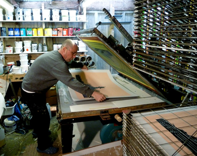
And a video that shows the screen printing process, nothing to do whit atom printing or the film, it’s just a youtube video :)
45. Bones
Posted: 05/09/2013 Filed under: Animation | Tags: 2d, Animation, anime, Art, drawing, drunk, film, gif, illustartion, illustration, making of, pen, Rotoscop, short film, skeleton, video, vimeo Leave a commentI finally got around shooting the skeleton shots (some of them anyway.)
Now you may wonder how do i rotoscop a skeleton??
Well it’s not easy… So I built a “Skeleton Costume” and I start from there and draw all the missing bits (bones really) the old way :)
The roto is SO painful, but drawing the spine and all the other thing is pretty fun. I’m saying that probably because I’m still doing the first shot.
Here is the test animation I made, to make sure that the suit worked… It’s not part of the film. I’m including the live footage, because let’s face it, it’s pretty stupide.

44. Deadman’s little helpers
Posted: 05/02/2013 Filed under: Animation, Making of | Tags: 2d, Animation, Art, beard, drawing, film, gif, hair, illustartion, making of, messy, pen, Rotoscop, short film, vimeo Leave a commentSo a few students from RCDC (Ravensbourne College of Design and Communication) backed the film’s kickstarter.
I met them at the Kickstarters end’s drinks, and for what ever reason when they’re not busy at school or on personal projects, they want to help on the film… Instead of partying and having fun! Crazy peops.
So they’re helping me shading some shots. To make sure everything is consistant I made this little “tutorial” on how to shade beard and hair on the film:

You can check it out in high quality on vimeo: https://vimeo.com/65075512
Anyway thanks Andreas, Amy, Ashley, Andreas and Matt
42. Same old, Same old
Posted: 04/19/2013 Filed under: Animation, Making of, Words | Tags: 2d, Animation, anime, Art, black, Cowboy, Desert, drawing, drunk, film, gif, illustartion, illustration, making of, messy, pen, pencil, Rotoscop, rotoscopy, short film, usa Leave a commentDamn, I’ve been dead busy with playing fancy dressing and drinking (for the live action of the film, obviously – well mainly) that I forgot to post last week!
Anyway there is much more black on the character now, and shading takes twice longer… If you want to start a 2d film, hand drawn, here’s an advice, make everything white! Damn that black T-Shirt is killing me.
So you can forgive me, here’s a little GIF, the walking drunk (it’s not the shot that caused me lots of pain):

40. Half
Posted: 04/04/2013 Filed under: Animation | Tags: 2d, Animation, Art, black, Cowboy, drawing, film, gif, Head, illustartion, illustration, pen, Rotoscop, rotoscopy, short film, white Leave a commentToday I finished shot MO_03_00 witch means that I reached 5 minutes 30 of animation!
That’s half the film animated!
This shot was a bitch, I emptied a whole pen to finish it, here’s a little preview:

39. Rewarding
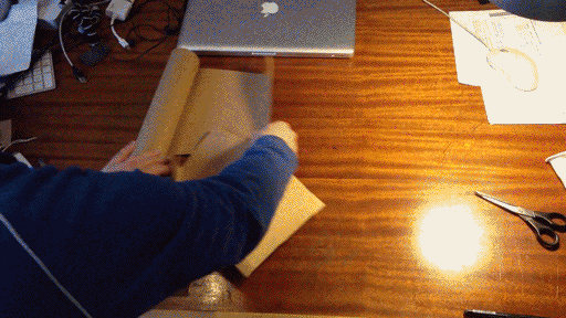
Posted: 03/28/2013 Filed under: Making of, Words | Tags: book, gif, illustartion, illustration, kickstarter, making of, pen, pencil, post, post office, red, short film, timelapse Leave a commentI’ve got around 150 packets to prepare for the Kistarter, so I’m starting early. (And this as nothing to do with the fact that I don’t feel like shooting more live action today, NOTHING)
The lucky 15 first fellas that pledged for the book and that sent me their address will receive their book very soon.
I’m sure the post man is gonna LOOOVE me.
And to celebrate this I made a GIF, obviously. (Might take a while to load)